Cards
Cards contain content and actions about a single subject.
On this page
Specifications references
Accessibility
Please follow accessibility criteria for development.
The contents within a card should follow their own accessibility guidelines, such as images having content descriptions set on them. The ODS library cards APIs forces the developers to add content descriptions on card images.
Variants
The library offers several Composables for Jetpack Compose implementation.
Vertical image first card
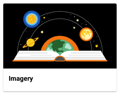
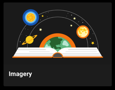
This is a full width card containing elements arranged vertically with an image as first element.
Jetpack Compose
In your composable screen you can use OdsVerticalImageFirstCard composable:
OdsVerticalImageFirstCard(
    title = "Title",
    image = OdsCard.Image(
        painterResource(R.drawable.picture),
        "Picture content description",
        Alignment.Center,
        ContentScale.Crop,
        Color(0xff1b1b1b)
    ),
    subtitle = "Subtitle",
    text = "Text",
    firstButton = OdsCard.Button("First button") { doSomething() },
    secondButton = OdsCard.Button("Second button") { doSomething() },
    onClick = { doSomething() }
)
OdsVerticalImageFirstCard API
| Parameter | Default value | Description |
|---|---|---|
title: String |
Title displayed into the card | |
image: OdsCard.Image |
Image displayed into the card | |
modifier: Modifier |
Modifier |
Modifier applied to the layout of the card |
subtitle: String? |
null |
Subtitle displayed into the card |
text: String? |
null |
Text displayed into the card |
firstButton: OdsCard.Button? |
null |
First button displayed into the card |
secondButton: OdsCard.Button? |
null |
Second button displayed into the card |
onClick: (() -> Unit)? |
null |
Callback invoked on card click |
Vertical header first card
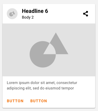
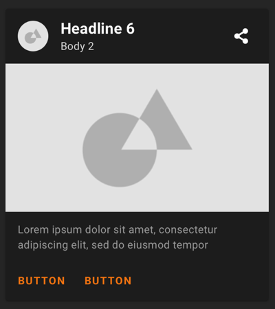
This is a full width card containing elements arranged vertically with a header (thumbnail, title & subtitle) as first element.
Jetpack Compose
In your composable screen you can use OdsVerticalHeaderFirstCard composable:
OdsVerticalHeaderFirstCard(
    title = "Title",
    image = OdsCard.Image(
        painterResource(R.drawable.picture),
        "Picture content description",
        Alignment.Center,
        ContentScale.Crop,
        Color(0xff1b1b1b)
    ),
    thumbnail = OdsCard.Thumbnail(
        painterResource(R.drawable.thumbnail),
        "Thumbnail content description"
    ),
    subtitle = "Subtitle",
    text = "Text",
    firstButton = OdsCard.Button("First button") { doSomething() },
    secondButton = OdsCard.Button("Second button") { doSomething() },
    onClick = { doSomething() }
)
OdsVerticalHeaderFirstCard API
| Parameter | Default value | Description |
|---|---|---|
title: String |
Title displayed into the card | |
image: OdsCard.Image |
Image displayed into the card | |
modifier: Modifier |
Modifier |
Modifier applied to the layout of the card |
thumbnail: OdsCard.Thumbnail? |
null |
Thumbnail displayed into the card next to the title: avatar, logo or icon. |
subtitle: String? |
null |
Subtitle displayed into the card |
text: String? |
null |
Text displayed into the card |
firstButton: OdsCard.Button? |
null |
First button displayed into the card |
secondButton: OdsCard.Button? |
null |
Second button displayed into the card |
onClick: (() -> Unit)? |
null |
Callback called on card click |
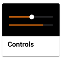
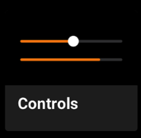
Small card
This is a small card which takes the half screen width.
Jetpack Compose
You can add an OdsSmallCard composable in your screen to add a small card:
Row(
    horizontalArrangement = Arrangement.spacedBy(16.dp),
) {
    OdsSmallCard(
        title = "Title",
        image = OdsCard.Image(
            painterResource(R.drawable.picture),
            "Picture content description"
        ),
        modifier = Modifier.weight(0.5f),
        onClick = { doSomething() }
    )
    OdsSmallCard(
        title = "Title",
        image = OdsCard.Image(
            painterResource(R.drawable.picture),
            "Picture content description"
        ),
        modifier = Modifier.weight(0.5f),
        onClick = { doSomething() }
    )
}
OdsSmallCard API
| Parameter | Default value | Description |
|---|---|---|
title: String |
Title displayed into the card. If the card is clickable, it will be truncated to fit on one line otherwise it will be displayed entirely for accessibility reasons. | |
image: OdsCard.Image |
Image displayed into the card | |
modifier: Modifier |
Modifier |
Modifier applied to the layout of the card |
subtitle: String? |
null |
Subtitle displayed into the card. If the card is clickable, it will be truncated to fit on one line otherwise it will be displayed entirely for accessibility reasons. |
onClick: (() -> Unit)? |
null |
Callback invoked on card click |
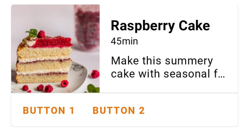
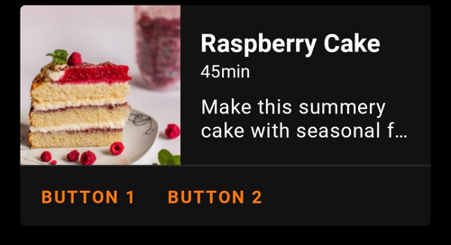
Horizontal card
This is a full screen width card with an image on the side. The image can be displayed on the left or on the right.
Jetpack Compose
In your screen you can use OdsHorizontalCard composable:
OdsHorizontalCard(
    title = "Title",
    image = OdsCard.Image(
        painterResource(R.drawable.picture),
        "Picture content description",
        Alignment.Center,
        ContentScale.Crop,
        Color(0xff1b1b1b)
    ),
    subtitle = "Subtitle",
    text = "Text",
    firstButton = OdsCard.Button("First button") { doSomething() },
    secondButton = OdsCard.Button("Second button") { doSomething() },
    imagePosition = OdsCard.Image.Position.Start,
    divider = false,
    onClick = { doSomething() }
)
OdsHorizontalCard API
| Parameter | Default value | Description |
|---|---|---|
title: String |
Title displayed into the card | |
image: OdsCard.Image |
Image displayed into the card | |
modifier: Modifier |
Modifier |
Modifier applied to the layout of the card |
subtitle: String? |
null |
Subtitle displayed into the card |
text: String? |
null |
Text displayed into the card |
firstButton: OdsCard.Button? |
null |
First button displayed into the card |
secondButton: OdsCard.Button? |
null |
Second button displayed into the card |
imagePosition: OdsCard.Image.Position |
OdsCard.Image.Position.Start |
Position of the image within the card, it can be set to OdsCard.Image.Position.Start or OdsCard.Image.Position.End |
divider: Boolean |
true |
Controls the divider display. If true, it will be displayed between the card content and the action buttons. |
onClick: (() -> Unit)? |
null |
Callback invoked on card click |
