Chips
Chips are compact elements that represent an input, attribute, or action.
On this page
Specifications references
Accessibility
Please follow accessibility criteria for development.
Chips support content labeling for accessibility and are readable by most screen readers, such as TalkBack. Text rendered in chips is automatically provided to accessibility services. Additional content labels are usually unnecessary.
Variants
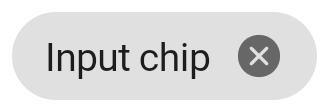
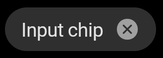
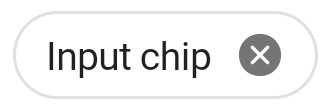
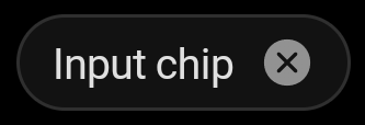
Input chip
Input chips (referred to as entry chips in Android) represent a complex piece of information in compact form, such as an entity (person, place, or thing) or text. They enable user input and verify that input by converting text into chips.
Jetpack Compose
Use the OdsChip composable.
Note that the chip style is outlined or filled according to your OdsTheme component configuration,
outlined by default.
OdsChip(
    text = "chip text",
    onClick = {
        doSomething()
    },
    leading = OdsChip.LeadingAvatar(
        painterResource(id = R.drawable.avatar),
        "Avatar"
    ),
    enabled = true,
    onCancel = {
        doSomething()
    }
)
OdsChip API
| Parameter | Default value | Description |
|---|---|---|
text: String |
Text to be displayed into the chip | |
onClick: () -> Unit |
Callback called on chip click | |
modifier: Modifier |
Modifier |
Modifier to be applied to the chip |
enabled: Boolean |
true |
Controls the enabled state of the chip. When false, this chip will not respond to user input. |
selected: Boolean |
false |
Controls the selected state of the chip. When true, the chip is highlighted (useful for choice chips). |
leading: OdsChip.Leading? |
null |
The leading content to be displayed at the start of the chip, preceding the text |
onCancel: (() -> Unit)? |
null |
Callback called on chip cancel cross click. Pass null for no cancel cross. |
Choice chip
Choice chips allow selection of a single chip from a set of options.
Choice chips clearly delineate and display options in a compact area. They are a good alternative to toggle buttons, radio buttons, and single select menus.
**Note: To display a set of choice chips please see Choice chips flow row **


Jetpack Compose
Use the OdsChip composable.
Note that the chip style is outlined or filled according to your OdsTheme component configuration,
outlined by default.
OdsChip(
    text = "chip text",
    onClick = {
        doSomething()
    },
    enabled = true,
)
Use the OdsChip API.
Filter chip
Filter chips use tags or descriptive words to filter content.
Filter chips clearly delineate and display options in a compact area. They are a good alternative to toggle buttons or checkboxes.


![]()
![]()
Jetpack Compose
Use the OdsFilterChip composable.
Note that the chip style is outlined or filled according to your OdsTheme component configuration,
outlined by default.
OdsFilterChip(
    text = "chip text",
    onClick = {
        doSomething()
    },
    leadingAvatar = OdsChip.LeadingAvatar(
        painterResource(id = R.drawable.avatar),
        ""
    ), // Set it to `null` for no avatar
    selected = false,
    enabled = true,
)
OdsFilterChip API
| Parameter | Default value | Description |
|---|---|---|
text: String |
Text to be displayed into the chip | |
onClick: () -> Unit |
Callback called on chip click | |
modifier: Modifier |
Modifier |
Modifier to be applied to the chip |
enabled: Boolean |
true |
Controls the enabled state of the chip. When false, this chip will not respond to user input. It also appears visually disabled and is disabled to accessibility services. |
selected: Boolean |
false |
Controls the selected state of the chip. When true, the chip is highlighted. |
leadingAvatar: OdsChip.LeadingAvatar? |
null |
Avatar to be displayed in a circle shape at the start of the chip, preceding the content text |
Action chip
Action chips offer actions related to primary content. They should appear dynamically and contextually in a UI.
An alternative to action chips are buttons, which should appear persistently and consistently.


Jetpack Compose
Use the OdsChip composable.
Note that the chip style is outlined or filled according to your OdsTheme component configuration,
outlined by default.
OdsChip(
    text = "chip text",
    onClick = {
        doSomething()
    },
    leading = OdsChip.LeadingIcon(
        painterResource(id = R.drawable.ic_heart),
        "Heart"
    ), // set it to `null` for no icon
    enabled = true,
)
Use the OdsChip API.
Extras
The ODS library provides some chips related components to facilitate the implementation of chips groups.
Choice chips flow row
This is a full width FlowRow containing selectable chips. It works like radio buttons, only one chip of the set can be selected.


Use OdsChoiceChipsFlowRow composable.
Note that the chips style is outlined or filled according to your OdsTheme component configuration,
outlined by default.
OdsChoiceChipsFlowRow(
    selectedChoiceChipIndex = selectedChoiceChipIndex,
    choiceChips = listOf(
        OdsChoiceChipsFlowRow.ChoiceChip("Choice chip 1", { selectedChoiceChipIndex = 0 }),
        OdsChoiceChipsFlowRow.ChoiceChip("Choice chip 2", { selectedChoiceChipIndex = 1 })
    ),
    modifier = Modifier.padding(horizontal = dimensionResource(id = com.orange.ods.R.dimen.spacing_m))
)
OdsChoiceChipsFlowRow API
| Parameter | Default value | Description |
|---|---|---|
selectedChoiceChipIndex: Int |
The index of the currently selected chip. | |
choiceChips: List<OdsChoiceChipsFlowRow.ChoiceChip> |
The list of OdsChoiceChipsFlowRow.ChoiceChip displayed into the chips flow row. |
|
modifier: Modifier |
Modifier |
Modifier applied to the chips flow row. |
