Sheets: bottom
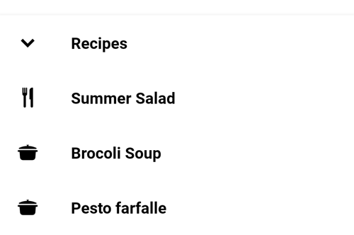
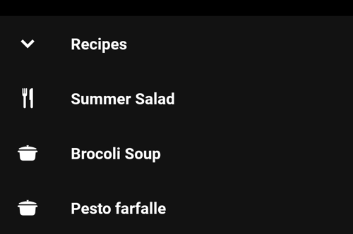
Bottom Sheets are surfaces anchored to the bottom of the screen that present users supplement content.
Use Sheets bottom to:
- Display content that complements the screen’s primary content
- Expose all complements options
On this page
Specifications references
Accessibility
Please follow accessibility criteria for development.
Implementation


The contents within a bottom sheet should follow their own accessibility guidelines, such as images having content descriptions set on them.
Jetpack Compose
OdsBottomSheetScaffold(
    sheetContent = {
        // Put here the content of the sheet
    },
    modifier = Modifier,
    scaffoldState = rememberBottomSheetScaffoldState(),
    topBar = null,
    snackbarHost = {},
    floatingActionButton = {},
    floatingActionButtonPosition = FabPosition.End,
    sheetGesturesEnabled = true,
    sheetPeekHeight = 56.dp,
    content = {
        // Put here the screen content
    }
)
OdsBottomSheetScaffold API #
| Parameter | Default value | Description |
|---|---|---|
sheetContent: @Composable ColumnScope.() -> Unit |
Content of the bottom sheet | |
modifier: Modifier |
Modifier |
Modifier applied to the bottom sheet scaffold |
scaffoldState: BottomSheetScaffoldState |
rememberBottomSheetScaffoldState() |
State of the scaffold |
topBar: (@Composable () -> Unit)? |
null |
Top app bar displayed in the scaffold |
snackbarHost: @Composable (SnackbarHostState) -> Unit |
{ SnackbarHost(it) } |
Composable hosting the snackbars shown inside the scaffold |
floatingActionButton: (@Composable () -> Unit)? |
null |
Floating action button displayed in the scaffold |
floatingActionButtonPosition: FabPosition |
FabPosition.End |
Position of the floating action button |
sheetGesturesEnabled: Boolean |
true |
Whether the bottom sheet can be interacted with by gestures |
sheetPeekHeight: Dp |
BottomSheetScaffoldDefaults.SheetPeekHeight |
Height of the bottom sheet when it is collapsed |
content: @Composable (PaddingValues) -> Unit |
Content of the screen |
